
Fonts are an integral part of the coding experience. They can affect our productivity and enjoyment. An exceptional font will be easy on our eyes, not causing severe eyestrain. It will also make code easier to read and write. And lastly, a great font will help us identify purpose and distinguish letterforms quicker, all which leads to legibility and readability. Over the years I have experimented with various fonts for coding. From this, I have learned that monospace fonts that support ligatures can provide with an excellent coding experience.
A Bit About Typography
Before we discuss what monospace and ligatures are, I think it will be helpful to talk a bit about typography. I won't spend too much time writing about everything in regards to it, but I will give you some surface level information about it. I encourage you to search and explore some of the terms I mention on your own, if you're interested.
Typography vs. Typefaces vs. Fonts
Surprisingly, in typography, there are many umbrella terms and ideas. However, don't worry, you definitely don't need to know any of it, in fact you can skip this entire section if you wanted to, but it's always nice to know some things about it.
First, you might hear words like typography, typefaces, and fonts, being used interchangeably. Even though closely related they mean slightly different things. Typography is the actual art of creating typefaces and fonts. This includes the arrangement, sizing (width and heights), coloring, and other styling of glyphs (letters, punctuation marks, numbers, etc.).
Typeface is a set of closely related glyphs, which can be referred to as a family. You can tell when they belong to the same typeface base on their style and consistency.
Within a typeface there various fonts, which you can think of variations within a typeface. Some variations can include thicker or thinner fonts (known as weights), italicized fonts, amongst others.
Here's a simplified visual hierarchy depicting how typography, typefaces, and fonts correlate. I have also created a concrete example using the Roboto typeface.
The Anatomy of a Character
First, a character is just a symbol representing a lower case or uppercase letter, number, punctuation mark, or other symbol such as the $ and %. Characters are semantical, they have meaning and are not arbitrary. A glyph is a more generalized term and just means the overall shape and design of a symbol.
Here's a visual representation of their relationships:
Characters can be further broken down into specific parts. For example there are parts of a character that are called a leg, arm, ear, shoulder, tail, spine... no we are not talking about a monkey, but let's continue... x-height, cap height, stroke, ascender, descender, swash, bar, serif... let's take a quick breath... terminal, bowl, counter, spur, stem, link, and loop[1]. I have likely missed some, but as you can see it's quite elaborate.
Categorizing Fonts
Fonts can also be categorized into different buckets based on their characteristics. Some common categories include sans-serif, serif, script, display, and monospace. The way I think of them are like genres for fonts. For example, Helvetica and Arial are considered sans-serif (sans means without) fonts, the serif refers to the strokes, which I typically call them the little tails in the characters. Times New Roman is a serif font since it has a bunch of little tails.
Let's take a closer look of some of the main typeface categories. First, notice how a sans-serif doesn't not have the little tails and it's blockier with straighter edges.
SANS SERIF MI1li0
Now notice how the following does have little tails (serifs) towards the end of the characters, hence why it's considered a serif typeface.
SERIF MI1li0
Monospace For Coding
When it comes to coding, usually monospace fonts are preferred. But what does that mean? In layman's terms, a font is considered monospace if all characters, whether it is a letter, symbol, or number it will occupy the same exact width. This also means if you stack two sentences on top of each other the characters will perfectly align perfectly with each other, essentially creating a sort of grid.
MONOSPACE MI1li0
Notice how the letter i, the number 1, and the letter M are the same width of the rest of the characters. This is not true for the sans-serif and serif examples above! In fact in non-monospace fonts the M and W are usually the widest, while the i, l, and 1 are the narrowest.
Ligatures
Finally, we get to ligatures! A ligature is basically the special ability for two or more characters (glyphs) to combine visually into one.
In modern typography, it's possible for two or more letters to interact with one another. One example of this mechanism is called kerning, which is the ability to automatically adjust the spacing between two characters. You might have experienced this when writing documents in Microsoft Word or Google Docs. You probably also have experience ligatures as well, but didn't even realize it. When you write two letters next to each other, for many popular fonts, word processors will make them appear as if they're combined or connected, but they're actually still two separate characters.
Unlike kerning, ligatures are a bit more complicated than just adjusting the spacing between two characters. Instead, characters can slightly or drastically morph to look differently at the surface level. When fonts that are used for coding are capable of doing this it leads to faster recognition of grouped characters and their representation. And that makes a significant impact when reading code.
In short ligatures provide the ability for two or more characters to interact with each other and change style or appearance depending on what character is adjacent to it. Not all fonts have this "special ability," but there are several fonts out there that do.
Countless Font Choices
When I first installed Visual Studio Code, it came with Consolas as the default font. Consolas is a monospace font, but it currently doesn't support ligatures. Overall, it isn't a bad font, but there are certainly better ones out there in my opinion, and with ligature support!
There are numerous free and open-source monospace fonts out there that I think look amazing. Here's a list of some of the them (note, not all the ones listed support ligatures):
- Gintronic
- San Francisco Mono (Apple)
- Droid Sans Mono
- Source Code Pro (Adobe)
- Hack
- Monoid
- JetBrains Mono
- Hasklig
- Maple Font
- Iosevka
- Fire Code
Other great ones that are not free include Dank, PragmataPro, Berkeley Mono Typeface, and MonoLisa (what a fun play on the word).
My Criteria for Choosing a Font
When I choose a new font for coding, the main criteria is for it to be a monospace font. Again, the uniformity in the character's widths make it easier to read.
Though monospace is great on its own, it becomes more magical if it supports ligatures. As a consequence, that's usually been a new feature I expect when trying new monospace fonts.
Illustrating the Importance of Ligatures
When writing code we deal with a lot of symbols, and they can mean different things depending on the preceding or succeeding character. For example in JavaScript there's the assignment operator =, the strict equality ===, the loose equality ==, strict inequality !==, loose inequality !=, and arrow function =>. Then we have the greater than >= and less than =< symbols.
The fact that the equal (=) and greater than (>) characters are used in different contexts, and have different meanings is already mentally taxing. Using ligatures while coding can solve this problem for us by helping us identify adjacent symbols quicker. Code becomes more legible.
Let's take a look at this trivial piece JavaScript code. Nothing special about it. Though there are lots of symbols I wanted to use to compare it with a ligature version of it.
const isPositiveEven = (num) => {
  const MIN_NUM = 0;

  return num % 2 === 0 && num >= MIN_NUM;
}

// other simple expressions
5 !== 10;
4 != "4";
4 <= 10;
1 == true;
7 === 7;
Now here's a screenshot of VS Code using Fira Code with ligatures enabled.
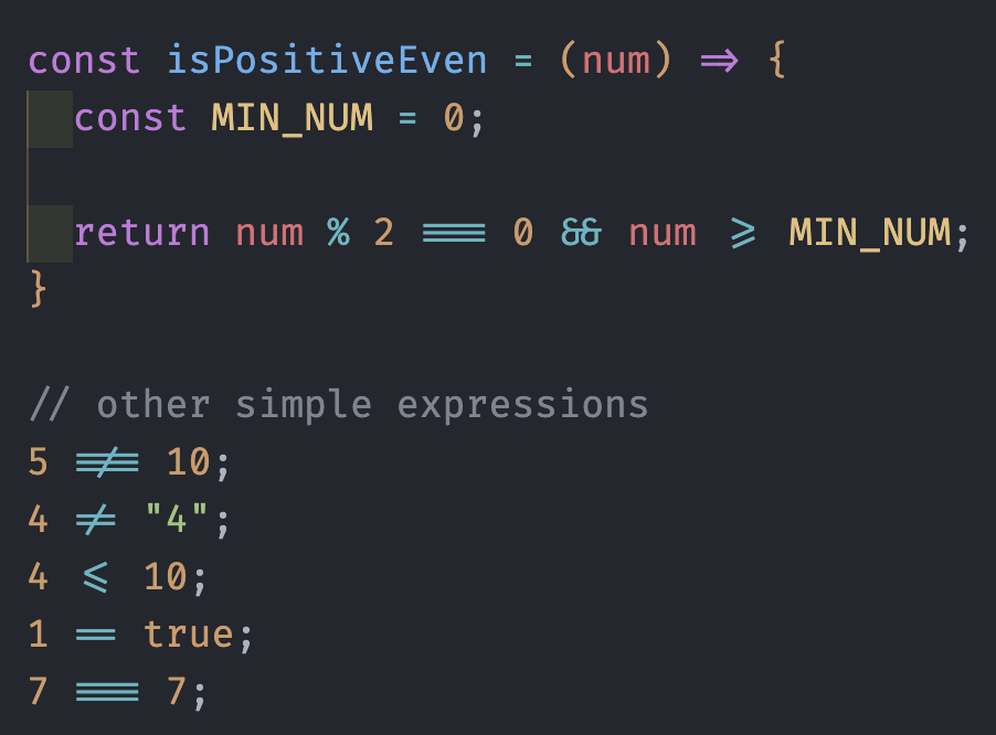
Compare the two examples, and observe how by using ligatures we can instantly disambiguate what the = and > are being used for.
In addition, we can clearly see literally an arrow for the arrow function, three bars for strict equality, two bars for loose equality, an equal sign with a slash through it for inequality, and lastly the good ol' greater than or equal and the less than or equal the same way we saw them in grade school! So cool right? And best of all because they're ligatures, they're still technically two or more separate characters, but are just visually combined into one. This means JavaScript code will still work!
Enabling Ligatures on VS Code
Let's get some ligatures. First, find a font that supports ligatures. The one I currently use is Fira Code, but there are a ton of options out there including some of those I listed above. Once you download and install the font on your machine, you're ready to set up ligatures on VS Code.
In VS Code open your preferences settings (Preference -> Settings). In the search type in "ligatures" then you'll be able to open the settings.json. You can also follow the steps described in StackOverflow answer to get to the settings.json if you prefer.
Once you have settings.json opened you might already have several settings set up, but basically all you need to add are the following two lines:
{
  "editor.fontFamily": "Fira Code",
  "editor.fontLigatures": true,
}
In the example above it is assumed you installed Fira Code, if you installed a different font make sure to change the editor.fontFamily value to the name of that font.
Once you do that, it should start working! I'm sure other IDE's have similar options, but I'll leave that for you to find out. Happy coding!